
What is Color Rendering Index (CRI) and Why is It Important?
Ever been in a room where the lighting made everything look… off? Enter the Color Rendering Index, or CRI for short. Think of CRI as a metric, rating from 0 to 100, that gauges how accurately a light source reveals the true colors of objects, materials, or people compared to a natural light source (like the sun!). Higher CRI values, especially those above 90, are pretty stellar – they depict colors more authentically.
Now, you might wonder, “Why is this a big deal?” Picture this: You’re in a store trying on clothes. In a dressing room with low CRI lighting, that navy shirt you’re considering might look black. Or imagine an art gallery where the fine nuances of a painting are lost. CRI matters because it impacts our perception, decisions, and appreciation of the world around us. It’s not just about making spaces look good; it’s about creating a realistic and trustworthy visual experience.

How Does Color Work?
Colors are a lot like magic tricks. They dazzle us, leave us awestruck, but the science behind them is intriguingly simple. At its core, color is a result of light interacting with objects and our eyes. Let me break it down for you.
Sunlight, although appearing white to our eyes, is a symphony of multiple wavelengths, each representing a different color. When this light hits an object, the object absorbs some wavelengths and reflects others. It’s these reflected wavelengths that our eyes pick up and interpret as color. For instance, a ripe tomato reflects red wavelengths and absorbs others, which is why we see it as red.
The twist? The quality of the light source can mess with this color show. Some light bulbs might not showcase the full spectrum of sunlight, leading to distorted color perceptions. This is why that tomato might not look as appetizing under a low-quality kitchen light. So, understanding color is essential, not just for photographers or artists, but for anyone who wants their environment to look and feel just right.
CRI is Invisible Until You Shine It on an Object
You can think of CRI as the unseen superhero of the lighting world. On its own, it’s like a latent power – it doesn’t reveal much. But the moment you shine a light with a specific CRI value onto an object, bam! Its true powers unveil.
Imagine you’ve got two flashlights. One is just a standard torch, while the other boasts a high CRI. If you light them up in a void with nothing around, they might seem identical. However, bring a vibrant fruit bowl into the scene, and the differences become startlingly evident. Under the high CRI flashlight, the fruits’ colors pop. The strawberries appear lusciously red, the bananas a vibrant yellow, and the grapes an enticing shade of purple. The regular flashlight? Not so much. The fruits might appear duller, less lifelike.
It’s akin to having a great audio system playing in silence; its true capability isn’t evident until you play a song. Similarly, CRI stays in the shadows, only truly manifesting its importance when objects come into the limelight. So, next time you pick a light, remember: what you don’t see can make all the difference.
How is CRI Measured?
Alright, now that we’ve grasped the magic of CRI, let’s dive into the nitty-gritty of how it’s measured. Get ready, because it’s a blend of art, science, and a bit of mathematics!
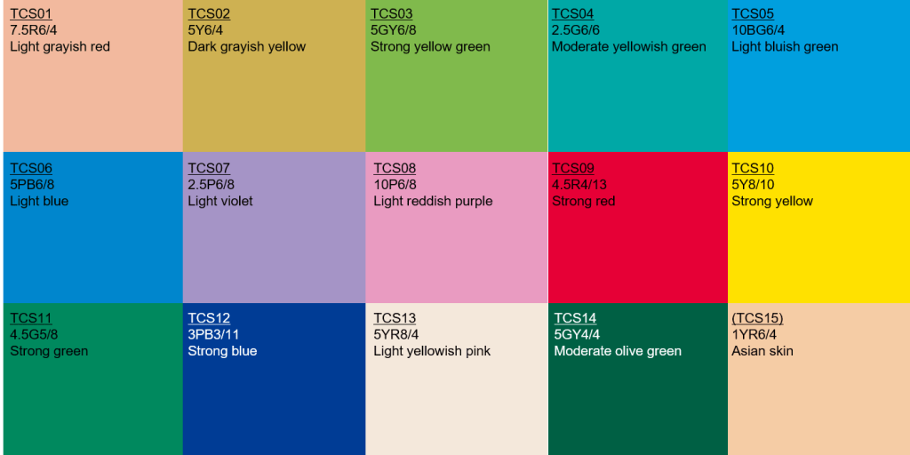
CRI measurement is essentially a comparison game. A light source in question is tested by illuminating a set of standard color samples. The colors of these samples under the light source are then compared to their appearance under a reference light source (typically natural sunlight or incandescent light, depending on the light’s color temperature). This comparison gives us a bunch of individual CRI values for each color sample.
Now, here’s where the math comes in. These individual values are averaged to produce the Ra value, which is the general CRI we often talk about. The scale runs from 0 to 100, with 100 being perfect (mimicking natural sunlight) and lower values indicating poorer color rendering.
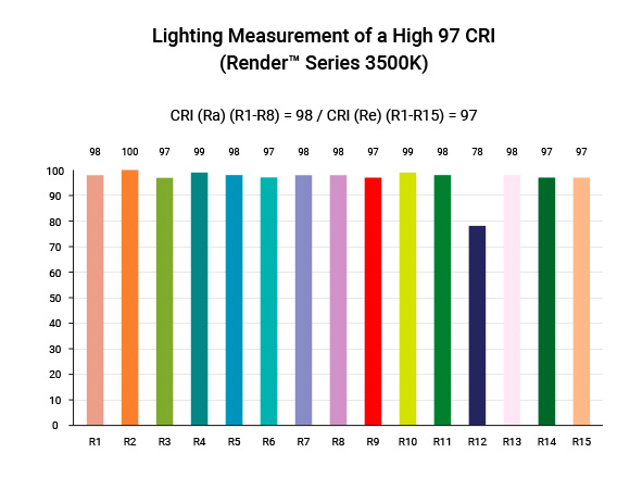
However, here’s a fun fact: even if a light has a CRI of 100, it doesn’t mean every single color looks perfect under it. It’s an average, after all. Some specific colors, like deep reds (known as R9 values), might still be misrepresented, which is crucial for applications like art galleries or retail stores.
In essence, measuring CRI is about understanding how faithfully a light source can play back the vivid tapestry of colors in our world. It’s not just a number – it’s a promise of clarity and authenticity.
Special Value: R9
Ah, the elusive R9 value. While CRI gives us a holistic view of color rendering, the R9 dives deep into one specific, and might I say, quite challenging color: a rich, saturated red. And trust me when I say this – red is a tough nut to crack in the lighting world!
The R9 value is one of the several individual color samples (technically named R1 through R15) used to determine the general CRI. But what sets R9 apart? Its significance lies in its difficulty for many light sources to render correctly, especially some LEDs. R9 tends to be a ‘problem child’ for these lights, often misrepresented or washed out.
But why should we care about one specific red? Well, think about places where accurate color representation is paramount. Hospitals, where skin tone assessments are critical. Retail, where clothing or cosmetics need to pop. Or think about your steak dinner. Under a light with a poor R9 value, that succulent piece of meat might just lose its appetizing allure.
So, while a high CRI score is awesome, always glance at the R9. If it’s high (close to 100), it’s a testament to the light’s ability to truly bring out the richness and depth of colors, especially those challenging reds. In the end, it’s these finer details that transform a space from ordinary to extraordinary.
What About Non-Daylight Color Temperatures?
Diving deeper into the world of lighting, we encounter a spectrum beyond just the sunlit shades. This spectrum is dictated by color temperature, measured in Kelvins (K). While daylight tones hover around 5000K to 6500K, offering a crisp, vibrant light, there’s a whole range of non-daylight temperatures that have their own tales to tell.
At the warmer end, you’ve got the cozy, amber-hued lights, typically around 2700K to 3000K. These are the candle-like glows that make living rooms feel intimate or give restaurants their romantic ambiance. They evoke feelings of warmth, relaxation, and nostalgia. On the flip side, higher Kelvin numbers, above the typical daylight range, can venture into a cooler, bluish territory. Think of the stark, clinical lighting of certain workshops or laboratories.
Now, here’s the catch with CRI: It’s often associated with how colors appear under daylight conditions. But non-daylight temperatures have their own charm and challenges when it comes to color rendering. A warm, low-Kelvin bulb with a high CRI won’t make colors pop like daylight, but it will represent colors authentically within its amber ambiance. Similarly, a cool, high-Kelvin bulb should stay true to its bluish tone while accurately depicting colors in its environment.
In essence, while daylight color temperatures serve as a standard, diving into non-daylight realms opens up a world of atmospheric possibilities. Just remember, no matter the shade of white you’re after, ensuring a good CRI remains key to keeping things real and relatable.
The Importance of CRI
Often brushed aside in favor of brightness or energy efficiency, the Color Rendering Index (CRI) is, without a doubt, the unsung hero of the lighting world. Let’s shed some light (pun intended) on its significance.
Imagine setting up a cozy reading nook. You’ve got the plush chairs, a good book, and a cuppa. But if the light bulb overhead casts a ghastly hue that misrepresents colors, it can turn your cozy haven into something that feels off. Or think about a boutique shop. Even the most exquisite fabrics can look drab and uninviting under poor lighting. That’s where CRI waltzes in, ensuring that colors appear as they truly are, adding authenticity to every experience.
In professional settings, high CRI is non-negotiable. Photographers, artists, and interior designers bank on accurate color representation. Medical professionals need it for accurate skin assessments. Heck, even chefs want their dishes to look as delectable as they taste.
But it’s not just about professionals. At home, when you’re choosing wall colors, dressing up for a date, or just enjoying a vibrant salad, a light with a good CRI makes every hue and shade come alive.
In a nutshell? CRI is the silent influencer. It impacts aesthetics, mood, safety, and even sales! It’s not just a number; it’s the essence of seeing the world in its true colors.
What are Common CRI Values and What is Acceptable?
Navigating the maze of CRI values might seem daunting, but let’s demystify it. While CRI can range from 0 (abysmal) to 100 (perfection), the real-world values and their implications vary depending on the context.
60-70 CRI: Found in many older fluorescent lights. Okay for basic utility lighting, like a garage or storage area, but colors won’t pop or look particularly accurate. It’s like watching a movie in low resolution.
70-80 CRI: A step up, these values are pretty standard for many commercial lighting applications. It’s decent for general lighting, but some nuances might be lost. Imagine listening to music where some of the subtle instrumental notes are slightly muted.
80-90 CRI: Now we’re in the realm of quality residential lighting. Here, colors are more vibrant and true-to-life. This range is great for living spaces, offices, and generally any area where people spend a lot of time.
90-100 CRI: The crème de la crème. A bulb in this range will render colors almost as accurately as natural sunlight. It’s ideal for spaces where precise color discrimination is paramount: think art studios, retail spaces, medical facilities, or your makeup table.
So, what’s acceptable? For most residential and office spaces, aiming for a CRI of 80+ is a good benchmark. However, for areas where color accuracy is the name of the game, pushing closer to 100 makes a world of difference.
Ultimately, CRI is more than just numbers; it’s about how you want to see and experience the world around you. Whether it’s the subtle hues in a painting or the vibrant colors of a market, the right CRI can genuinely transform your experience.
Generally Accepted CRIs for Various Applications
When it comes to lighting, one size certainly doesn’t fit all. Different spaces and tasks demand specific CRI values to ensure optimal performance and aesthetics. Let’s dive into the generally accepted CRI values for some common applications:
Residential Living Spaces: For areas like your living room, bedroom, or dining space, a CRI between 80-90 provides a comfortable and natural lighting atmosphere. It’s perfect for daily activities and creates a cozy ambiance.
Offices and Workspaces: In these areas where clarity and focus are essential, a CRI value of 85+ is recommended. Good lighting not only boosts productivity but also reduces eye strain during long work hours.
Retail Stores: Presentation is everything in retail. A CRI of 90 or higher ensures products are showcased in their best light, literally. Whether it’s clothing, jewelry, or cosmetics, accurate color rendering can influence purchasing decisions.
Art Studios and Galleries: Here, the nuances matter. A CRI close to 100 is almost mandatory. Artists need to see their work in the most authentic light, and gallery visitors should experience art as the creator intended.
Medical Facilities: Hospitals and clinics prioritize a CRI of 90+. Accurate skin tone and tissue color assessments can be critical in medical diagnoses and treatments.
Industrial Workspaces: While color accuracy might not be the top priority in warehouses or factories, a decent CRI of 80+ is still preferred for safety and visibility.
Restaurants and Cafés: A slightly lower CRI between 80-85 can be ideal, emphasizing warmth and ambiance over strict color accuracy. After all, you want that dinner setting to be intimate and cozy.
Outdoor Spaces: For outdoor lighting, such as streetlights or garden lights, a CRI of 70+ suffices. Here, visibility and safety are more crucial than color nuances.
In essence, the right CRI is context-dependent. While high values are universally better for color accuracy, the “perfect” CRI balances both functional and aesthetic requirements of the space in question. It’s all about setting the right mood while ensuring the task at hand is efficiently catered to.
Final Thoughts
Navigating the world of lighting, CRI stands out as an unsung hero, dictating how we perceive and interact with our surroundings. From the coziness of our homes to the precision required in art studios, the right CRI value can transform experiences. While numbers and technicalities are essential, the essence of CRI lies in its ability to breathe life into spaces, ensuring colors resonate authentically. As lighting technology evolves, ensuring a high CRI remains a beacon of quality. After all, in a world bursting with color, why settle for anything less than true-to-life brilliance?ing a dining space, hanging over a reception desk, or adding flair to a lounge, their downward-focused light combined with diverse designs can transform a space. Interior Innovations Magazine recently spotlighted pendants made of sustainable materials as a rising trend.
How To Create Lighting according to Non-Standard Hotel Styles
Hotels breaking the mold need lighting that stands out. Think unconventional fixtures, bold colors, or interactive light installations. Lighting should resonate with the hotel’s unique theme, be it bohemian, futuristic, or vintage. A feature in Unique Hotel Designs celebrated spaces where guests can control light colors, intensity, and even patterns.
Non-Standard Hotel
Embracing a non-standard design means pushing boundaries. This could translate to a blend of vintage chandeliers with modern LEDs, or a room where lights respond to guests’ moods. The key is experimentation, ensuring comfort and functionality aren’t sacrificed. As the Avant-Garde Design Journal puts it, “Be bold in vision, but rooted in the guest experience.”
Final Thoughts
The art of hotel lighting transcends mere illumination. It crafts experiences, molds perceptions, and evokes emotions. In the hospitality industry, where guest experience is paramount, strategic and thoughtful lighting can become a hotel’s silent ambassador. From the grandeur of the lobby to the intimacy of a suite, each light fixture tells a story, creating memories for guests. As we’ve journeyed through the nuances of hotel lighting, it’s clear that a harmonious blend of aesthetics, functionality, and innovation is vital. In this era of experiential travel, let your hotel’s lighting shine bright, setting the stage for unforgettable stays.